RETAIL
Dutch State Lottery
Brand identity, web design, signage and brand activation
Orange heroes returning home
The Dutch State Lottery (Nederlandse Staatsloterij) is the largest lottery in the Netherlands and one of the oldest lotteries in the world.
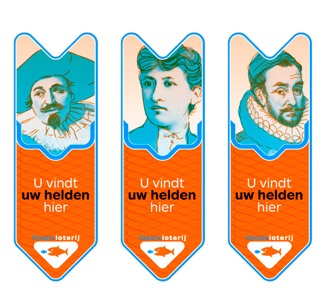
Due to an opening European lottery market back in 2008, there was a direct need for a much stronger brand presence than the lottery had before. Until then the only brand elements were the fish and the color orange, a more elaborate and engaging brand identity or experience was lacking completely.
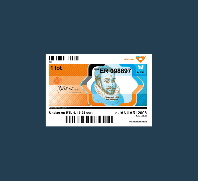
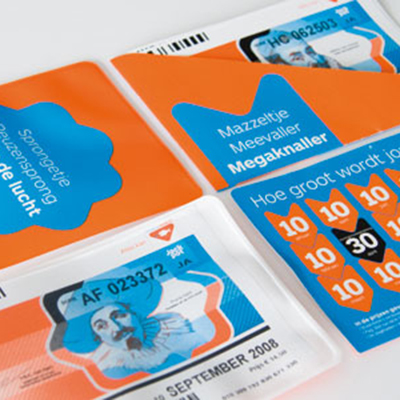
Starting with only those two elements, we came up with a brand identity that was much more expanded. First we gave the logo more weight and visual power by always putting the fish into a shielded shape triangle. Based on that, we created a graphical language that is simple but strong and typically Dutch by it's colorfulness and playfulness. On top of that we re-introduced a few Dutch heroes, some of which used to be featured on the old guilder paper money. This reference also led to the use of spirographic shapes that reappear often — adding a sense of value and preciousness to the tickets and other items.
This identity was then used to create a broad set of items, from the actual lottery tickets and a new website to a varied set of visual merchandising and advertising items.
First exploration into possible design directions

New lottery logo with pay-off

Production process of the lottery tickets, from design to final print work


Brand manual containing all elements to build every possible carrier with

The new brand identity was also applied to several tv commercials
Ideation and sketches for visual merchandising and activation items
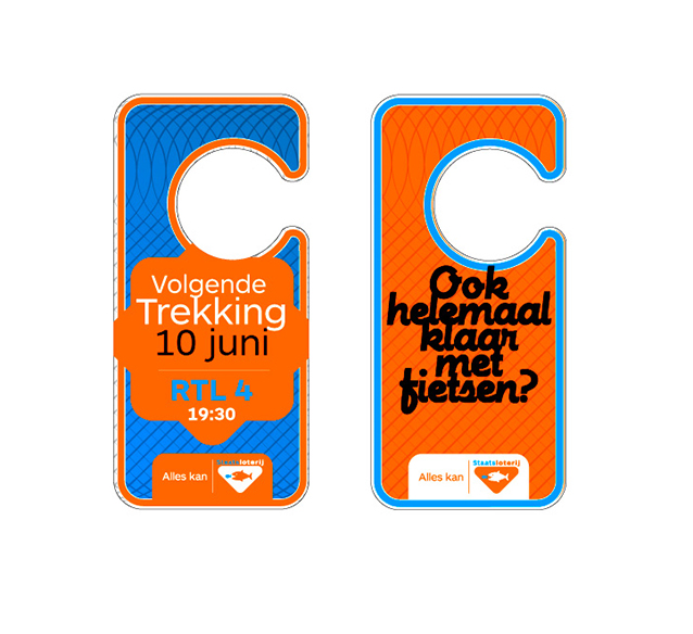
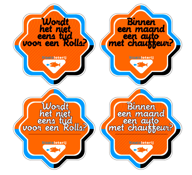
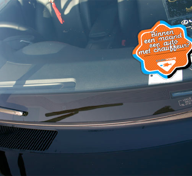
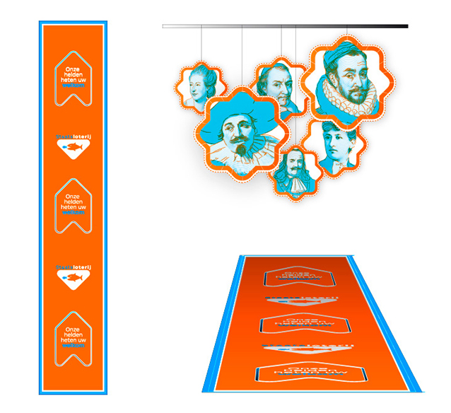
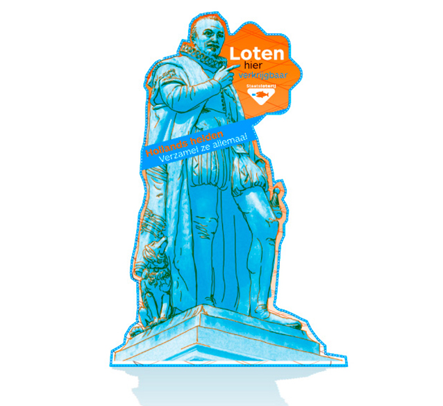
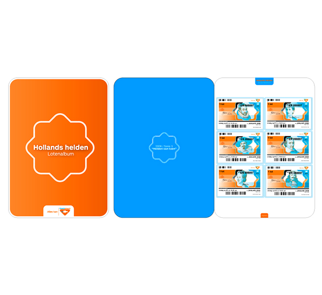

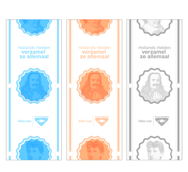
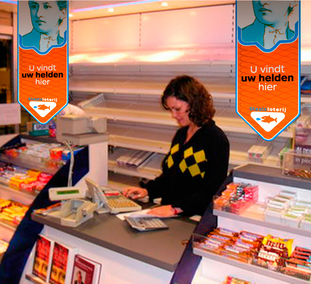
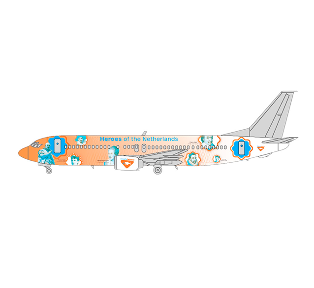
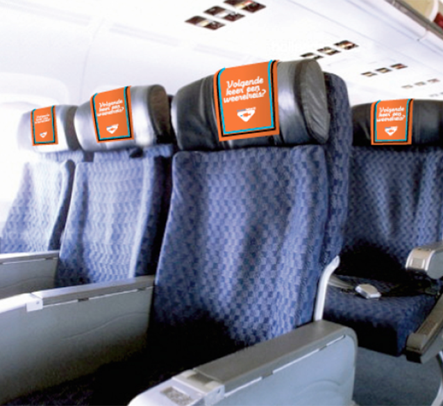
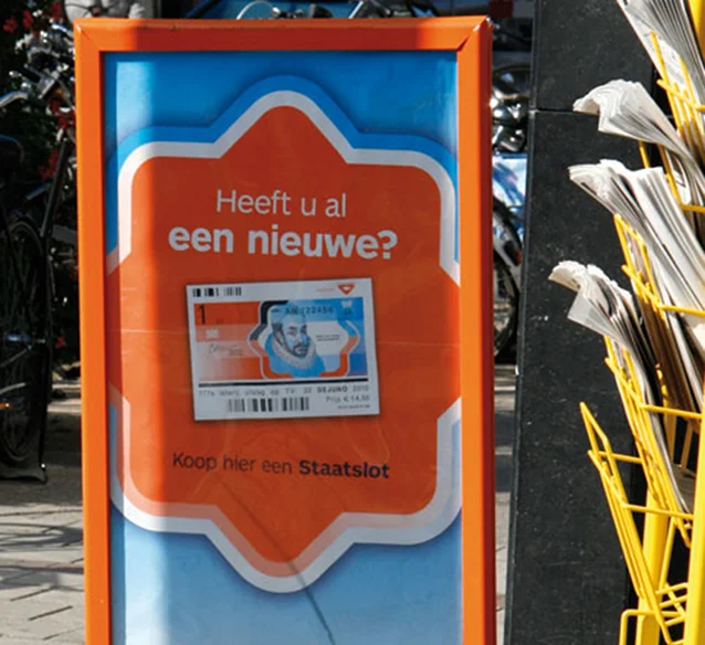
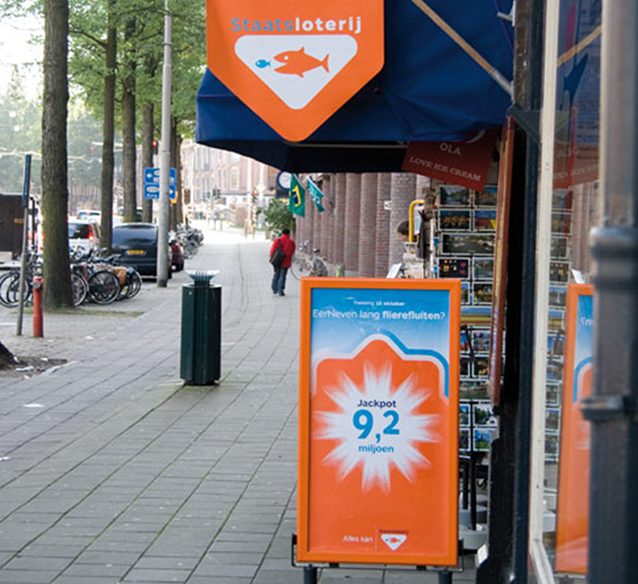
A few examples of direct marketing tools, outdoor advertising and visual merchandising


Website, as it was launched in 2008

TEAM
Project initially executed at QuA Associates
Erik Schuur
Creative direction, concept and design