
HEALTHCARE
GGNet
Brand identity, print and web design, signage & way finding
Share Your Life
GGNet is a large mental health organization which operates mainly in the east of the Netherlands. It offers a wide variation of therapies and treatments to an equally varied group of patients. Together with Ubachs Full Contact, GGNet developed a new strategy in order to improve their care offer as well as strengthen their position as a forerunner in their field. After completion, GGNet wanted to make this new strategic direction tangible by the development of a new visual identity, which was developed by us in cooperation with Day Creative Business Partners.
The strategy’s main focus is to improve and, when needed, create the most optimal level of connection between patients and the outside world, as well as between all parties that play a role in the treatment process. Only by optimizing this framework, GGNet’s main goals can be reached: decreasing unnecessary dependency and improving actual recovery.
This has lead to a visual identity that opens up a world that — in stead of being plain binary — consists of a very varied group of people with their own stories, challenges and ideas about the right treatment. The new visual identity is more impactful than the previous one, but at the same time warmer, and more personal and inviting. It gives room for the honest and sometimes rough story, but also breathes a level of optimism. This approach has proven to be very recognizable for, and appreciated by all stakeholders — which isn’t at all common when organizations like GGNet decide to go for a rebranding.
The foundation of our work is summarized in a design manual where attention goes out to the visual identity building blocks as well as to a range of different communication tools. All building blocks (things such as color palette, type, the new logo and rules for the style and use of imagery) are embedded within the strategy and design narrative in order to guarantee the approval of the complete group of stakeholders.
Using the building blocks, we developed both a general and a careers website. On top of that, we created a series of templates for communication tools, ranging from stationery to leaflets and brochures. By offering these as templates, we could work cost efficiently and also offer GGNet the chance to work with more local parties for the actual execution.
The various building blocks of the new visual identity

The new logo
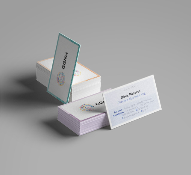
Various stationery items


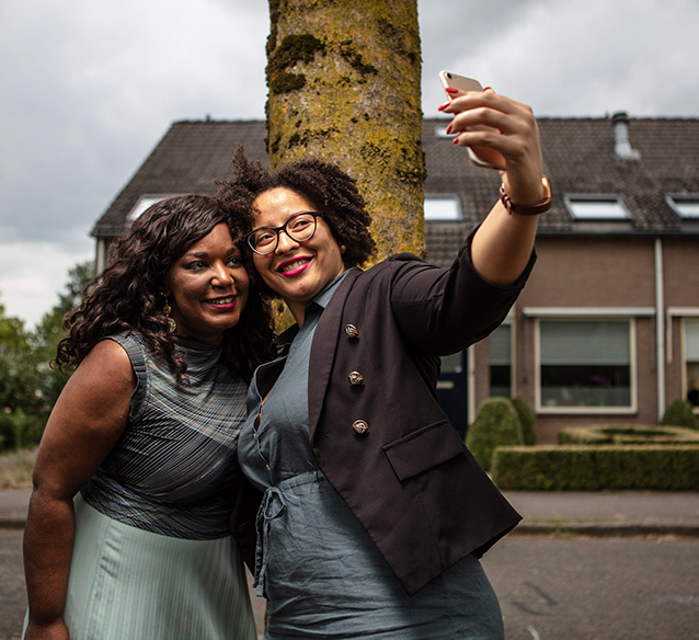
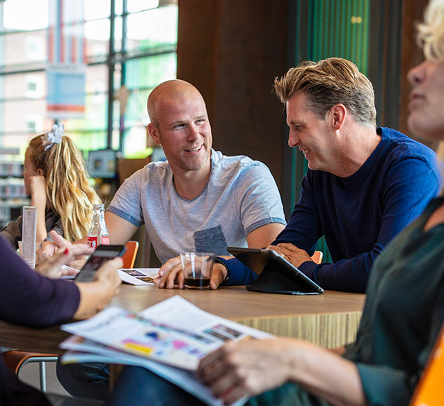
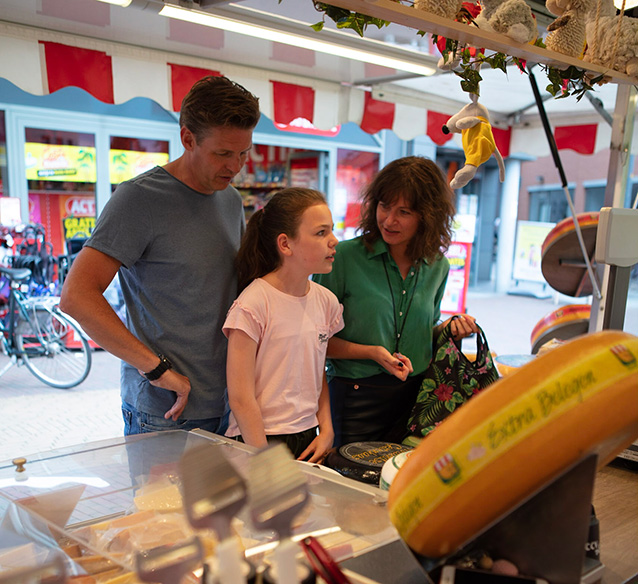
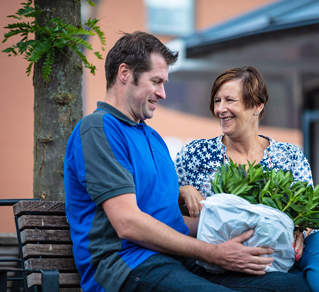
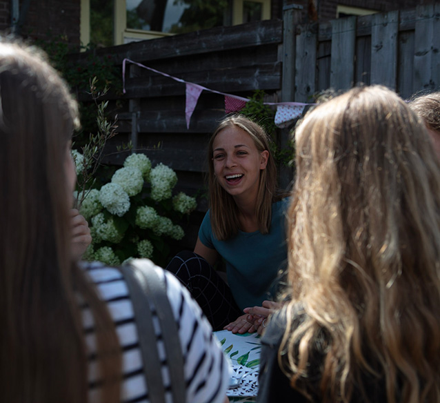
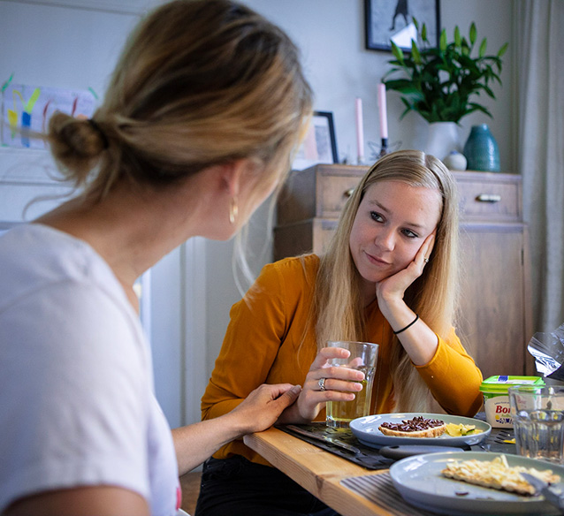
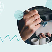
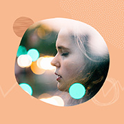
Examples of the treatment of imagery in a combination of photography and illustrative elements

Several pages from both the general and the careers website


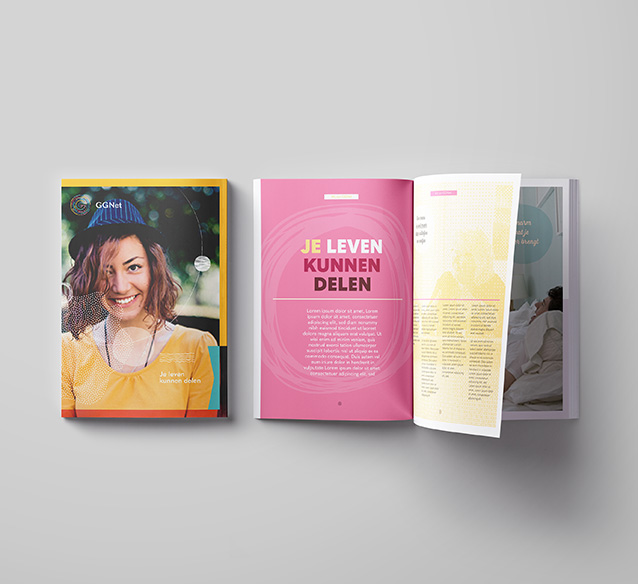
Design template for GGNet's general brochure


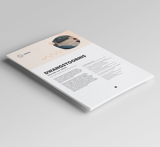
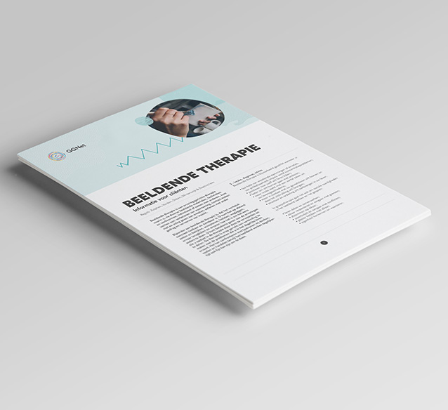
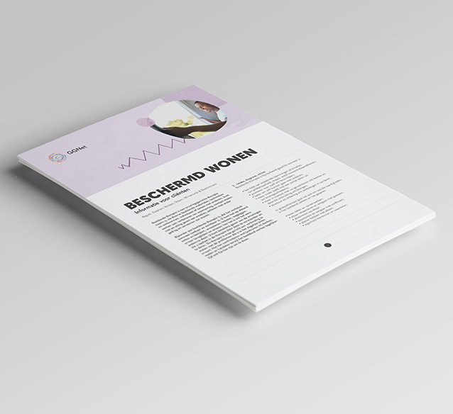
Leaflet and flyers aimed to inform clients and their environment about mental illness and therapy options

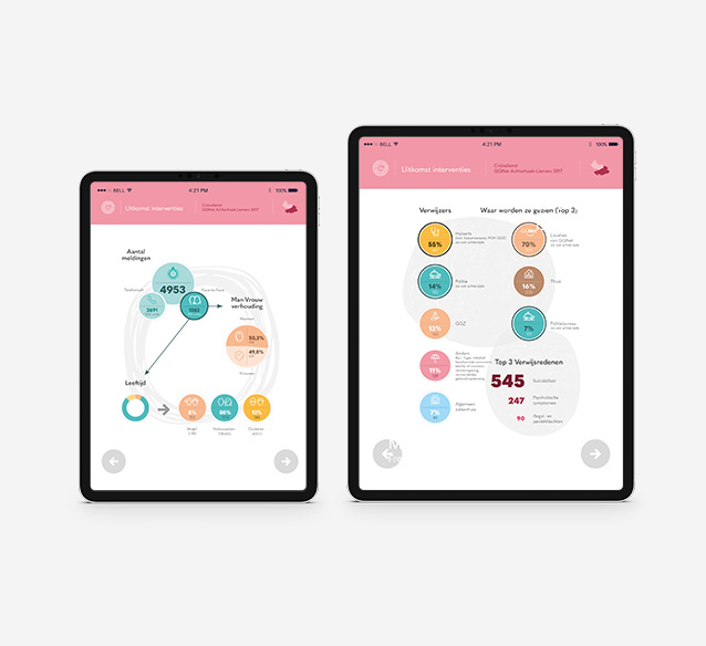
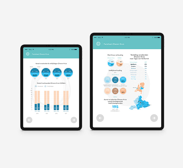
Infographics system used for several factsheets

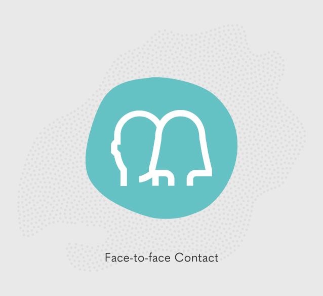
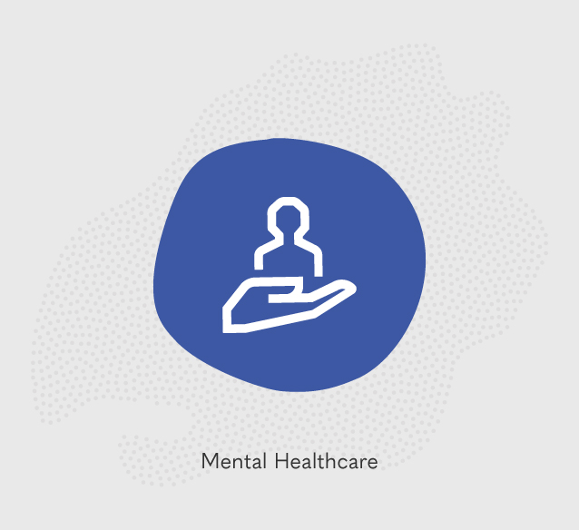
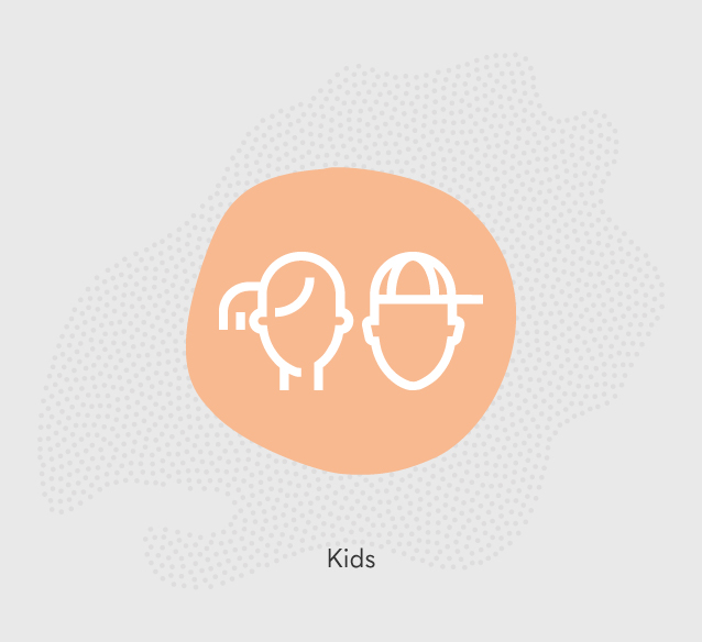
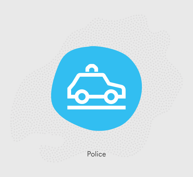
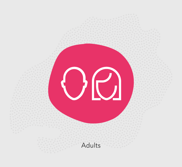
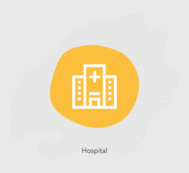
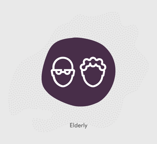
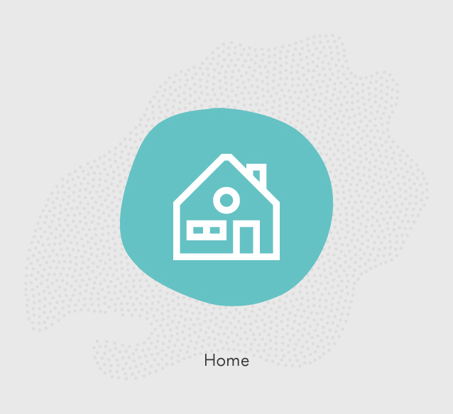
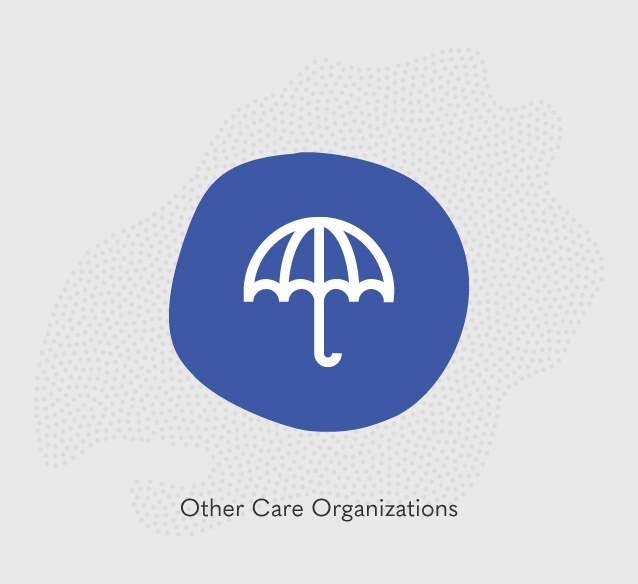
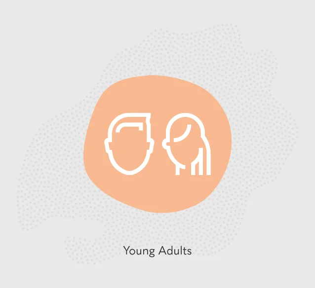
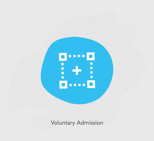
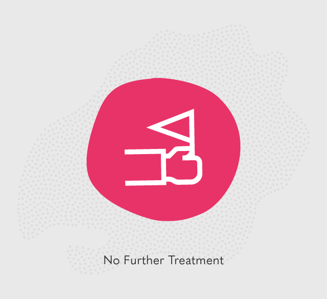
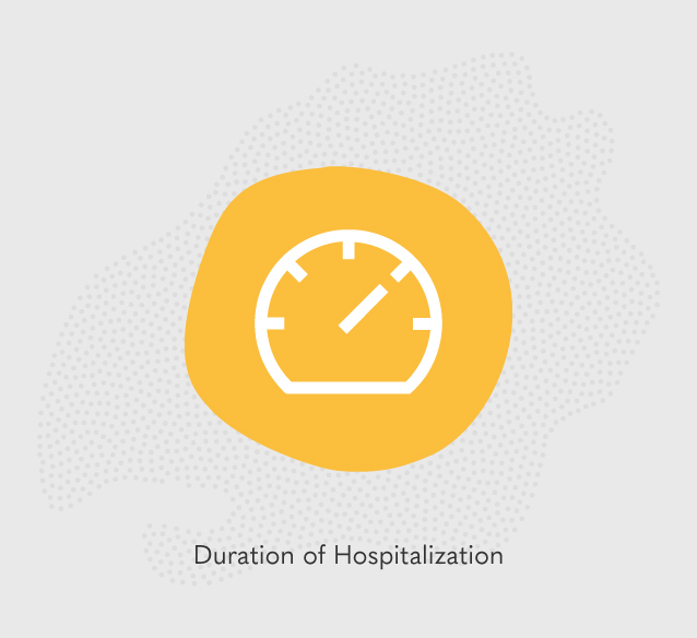
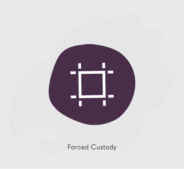
A set of icons supports all kinds of messaging
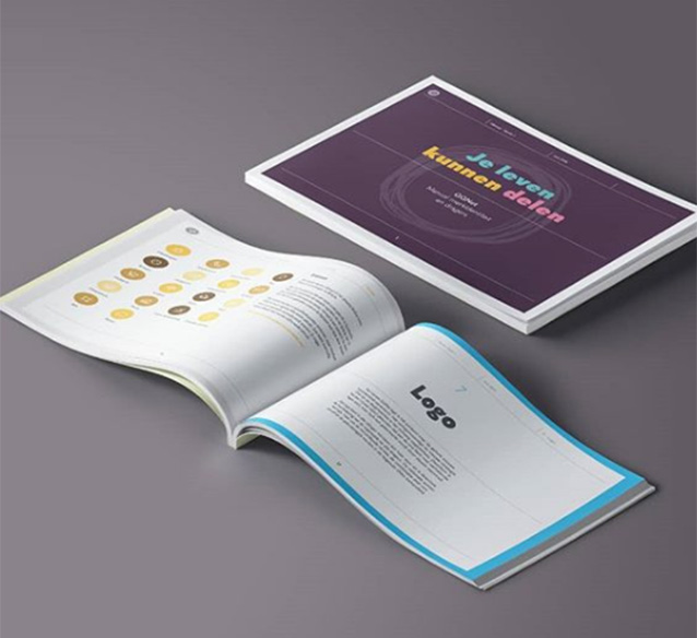
The visual identity and designs for the various tools were all summarized in a manual
In partnership with
TEAM
Erik Schuur
Creative direction, concept, design
Louk de Sévaux
Strategy, concept
Anniek Koelmans / Day
Project management