
RETAIL
Hudson's Bay The Netherlands
Sinterklaas Campaign Identity & Collateral
December Sweetness
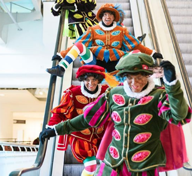
In the Netherlands, the December holidays period is divided in two main periods, both of which are of key importance to retailers. In the first weeks, the main focus is on celebrating the birthday of Sinterklaas. After December 5th, the focus shift completely towards Christmas. Hudson's Bay asked us to develop the in-store promotional campaigns for both celebrations in 2017.
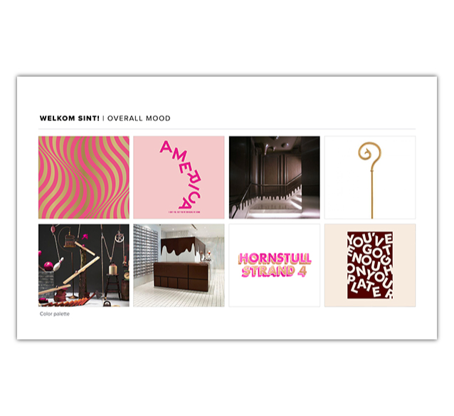
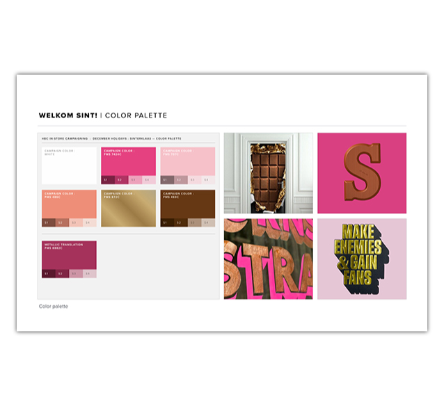
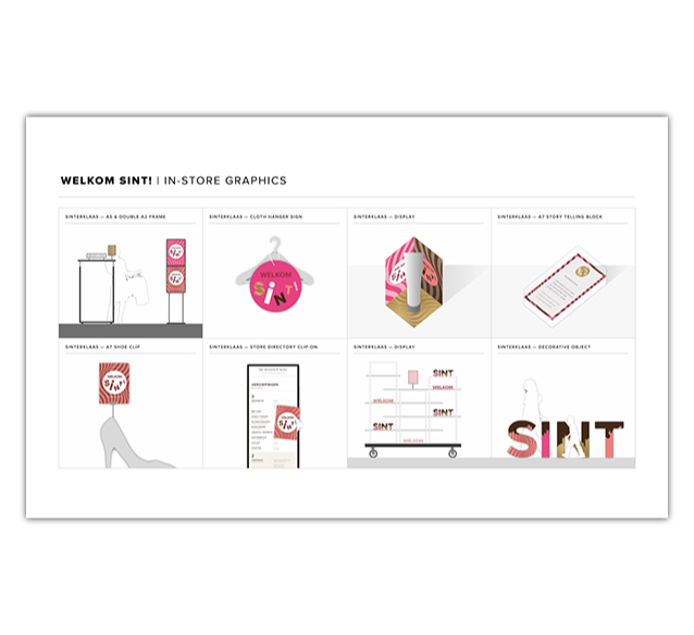
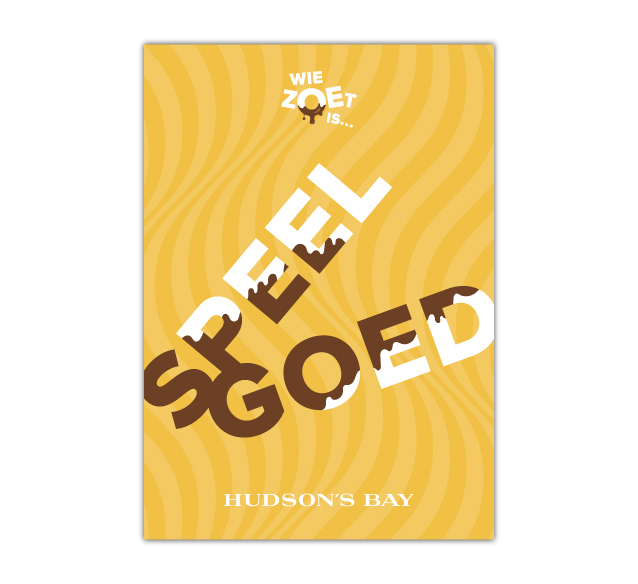
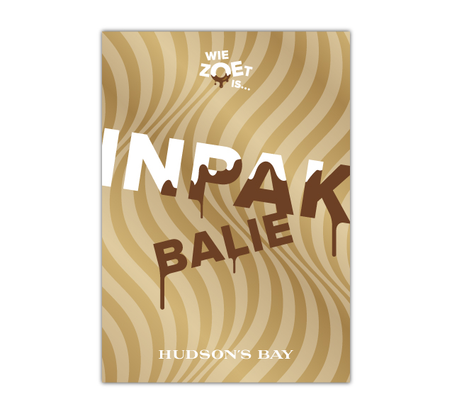
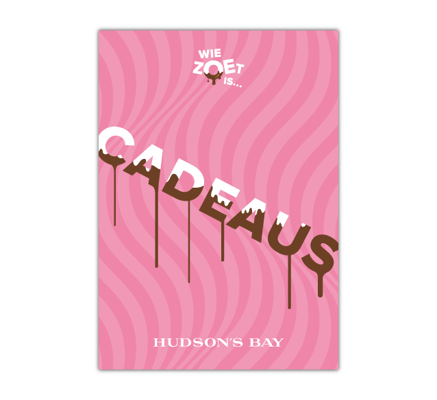
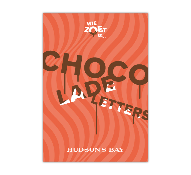
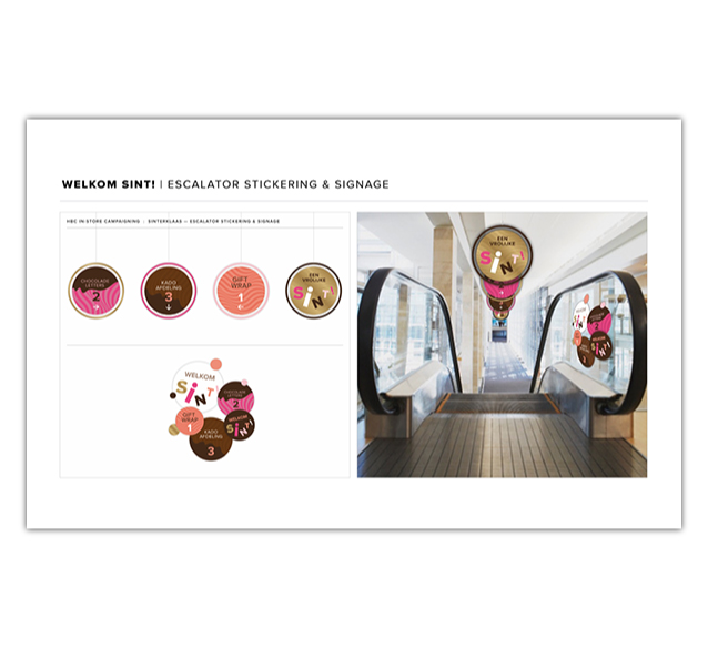
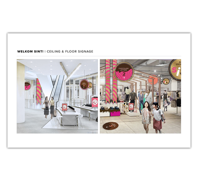
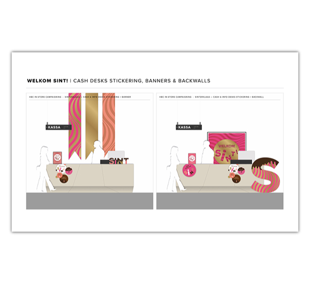
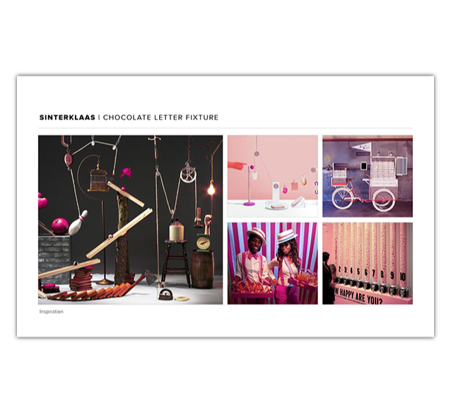
The Sinterklaas campaign was inspired mainly by the sweet-toothed aspect of this celebration of children's patron Sinterklaas. In the weeks around his birthday, Dutch children are treated with candy, chocolate letters and so-called pepernoten. The look and feel of typical Sinterklaas sweets and candy wrappings was combined with the decadent idea of dripping chocolate in order to create a visual language that is happy, festive and colorful. This was then applied to a whole range of communication carriers, from in-store directional signs to gift wrapping papers and animations.
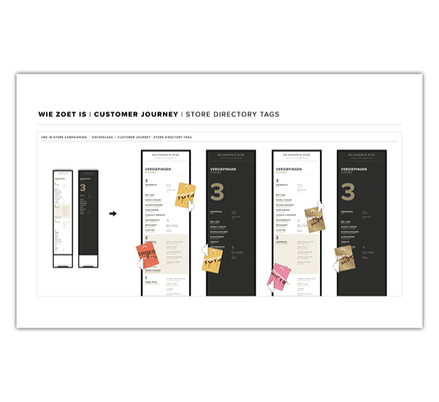
Visual design concept and building blocks

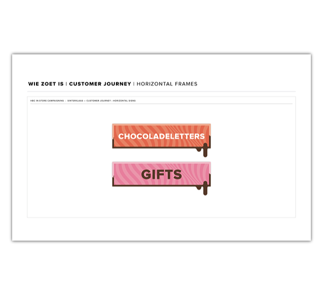
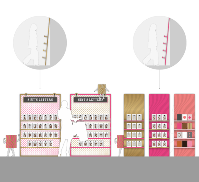
Signage elements, playing with the idea of dripping chocolate letters
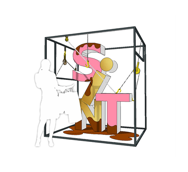
3D type for shop windows and several locations throughout the stores


Several designs for in-store campaign signage


TEAM
Erik Schuur
Design
John van Dorst
Creative director
Mendy van Velzen
Art director
Roosmarijn Groenendijk
Project management