RETAIL
Hudson's Bay The Netherlands
Signage & Way-Finding
A Dutch take on a Canadian Legend
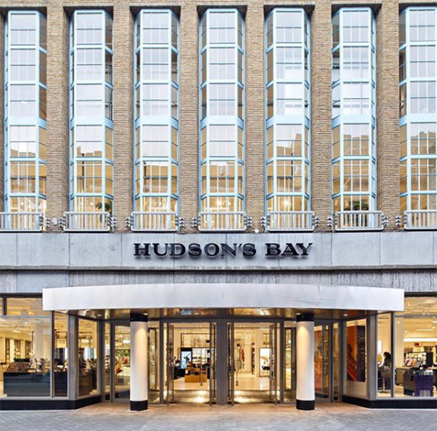
Canadian department store chain Hudson’s Bay opened ten new stores across the Netherlands in 2017. They saw a need for a specifically Dutch brand presence, which should also be reflected in all graphic design elements inside and outside the stores. We were asked to to take care of creating their visual design building blocks and designs for signage, way-finding and in-store promotions.
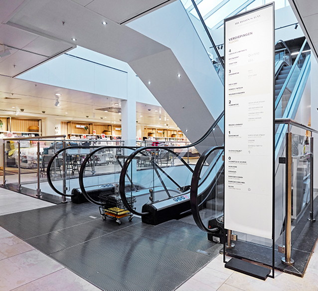
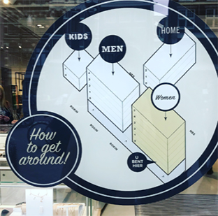
Signage and way-finding are important elements enabling customers to navigate a store easily. At the other hand, too many way-finding elements could be perceived as restrictive and as visually conflicting with all other visual messages and products that the store has on offer.
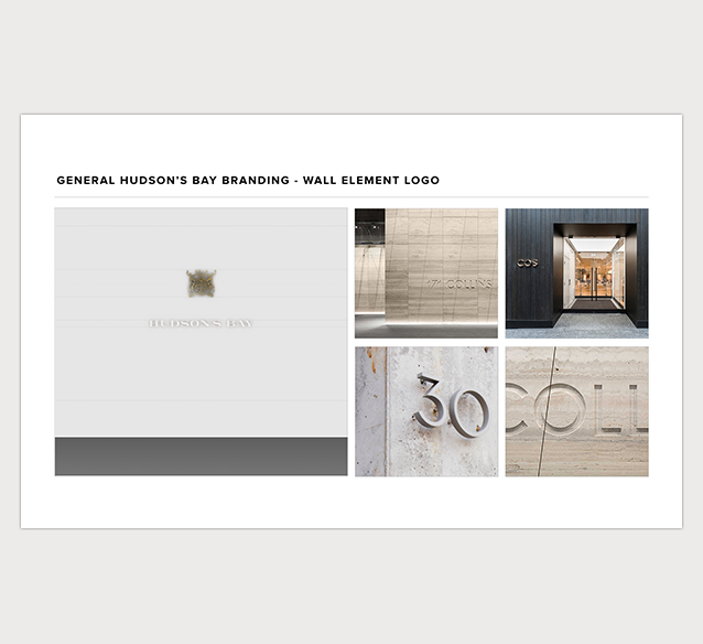
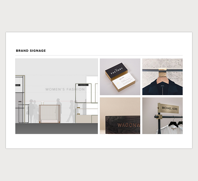
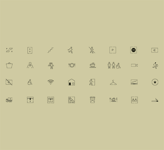
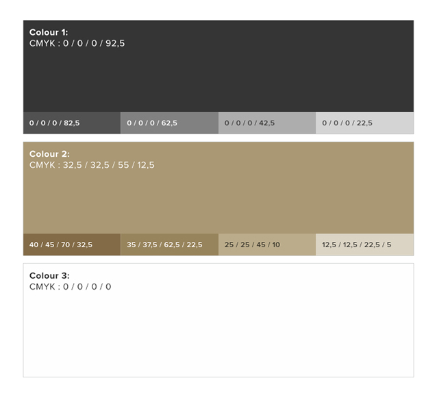
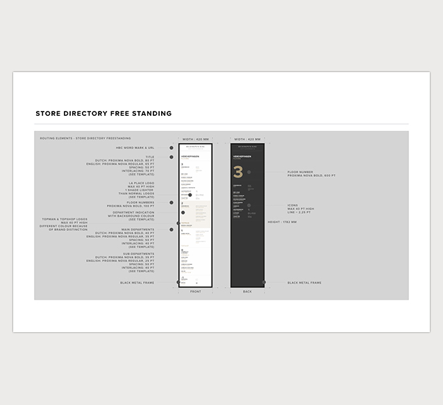
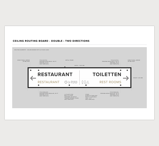
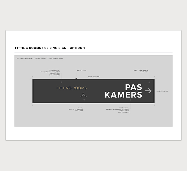
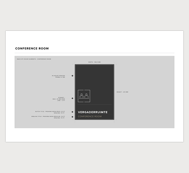
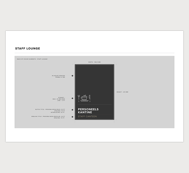
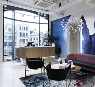
We therefore came up with a system that is minimalist, modest, yet elegant. The restricted color palette is based on the interior design. All elements were produced in materials linked to the store’s outfit. Special attention was paid to the design of a tailor-made icon set, which makes navigating the store even easier and independent of language.
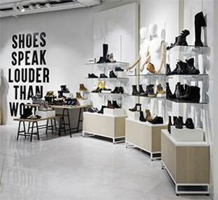
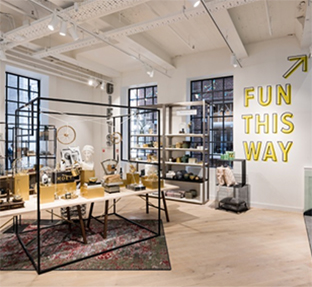
Besides developing the usual way-finding elements such as signs and stickers, we also created a more intuitive layer in order to develop distinct zones throughout the stores. These are clarified using decorative wallpapers and (typo)graphical wall graphics.
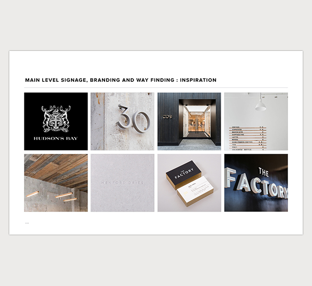
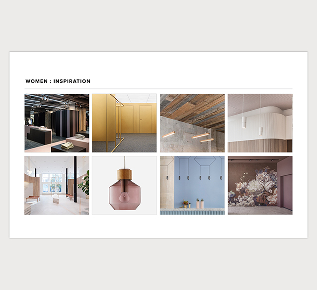
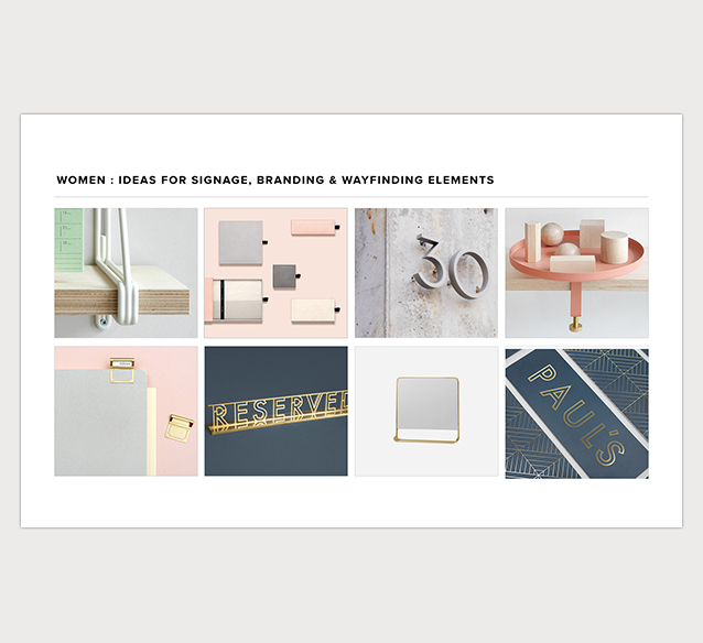
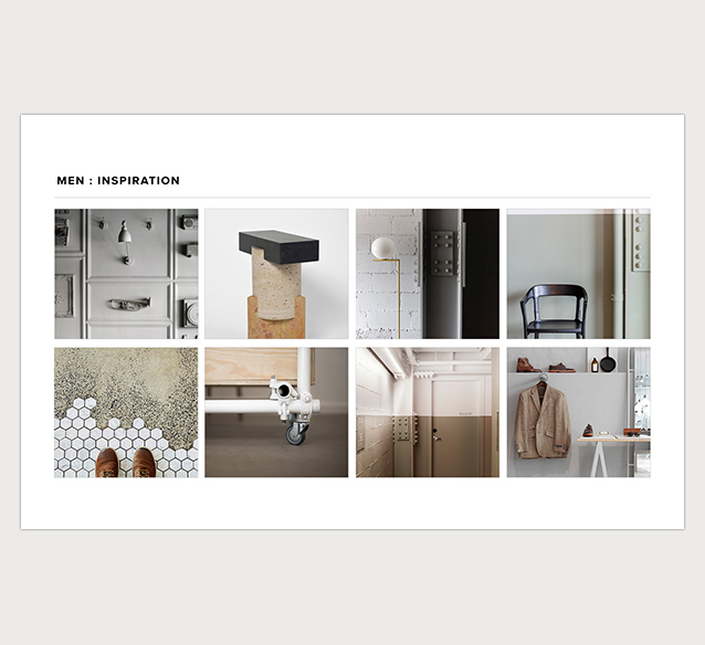
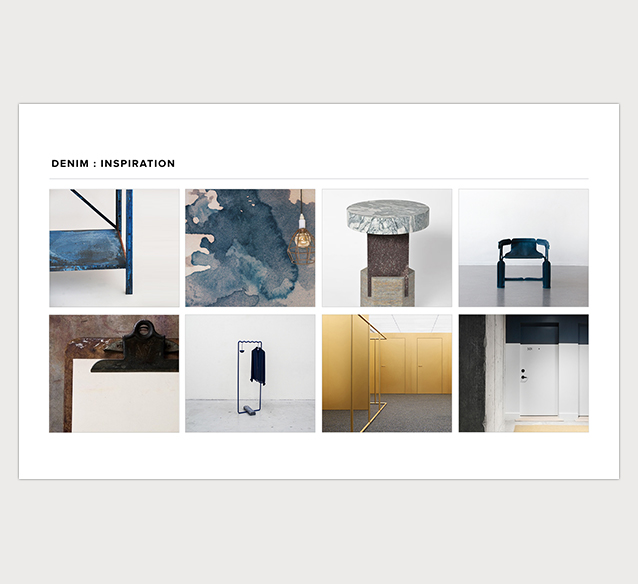
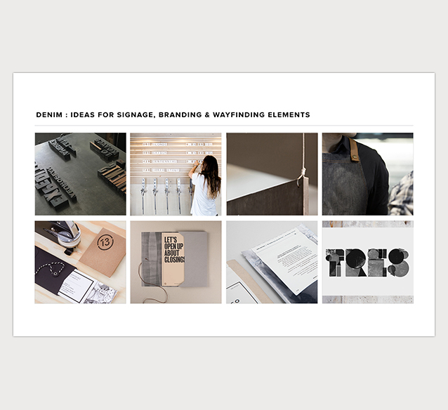
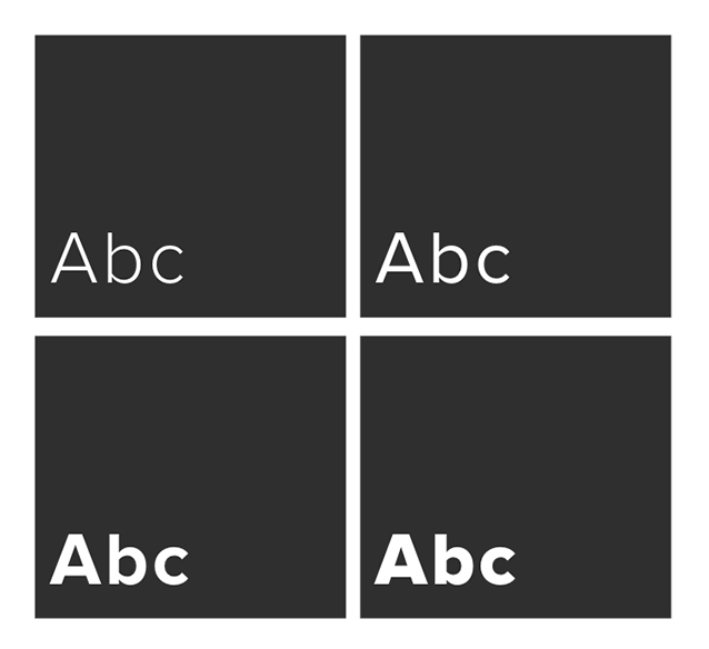
The design concept, visualized in inspiration boards
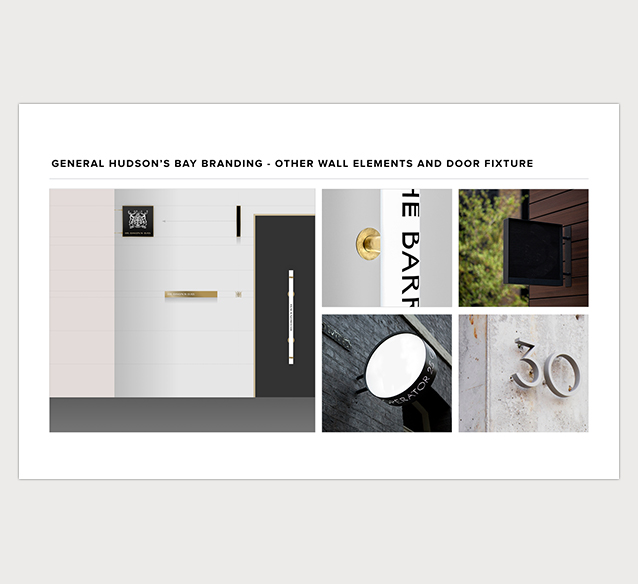
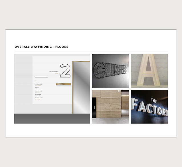
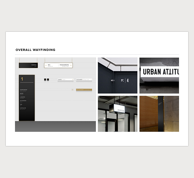
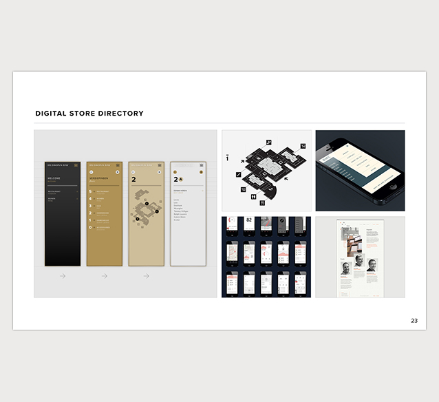
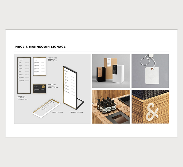

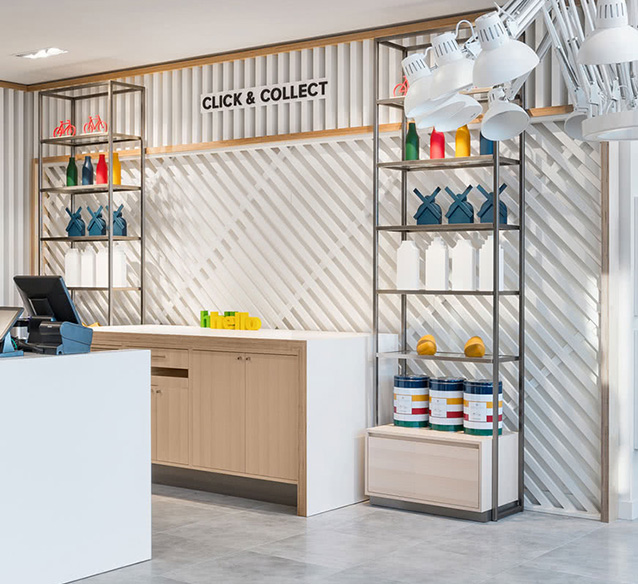
Visual design building blocks and templates for all way finding elements
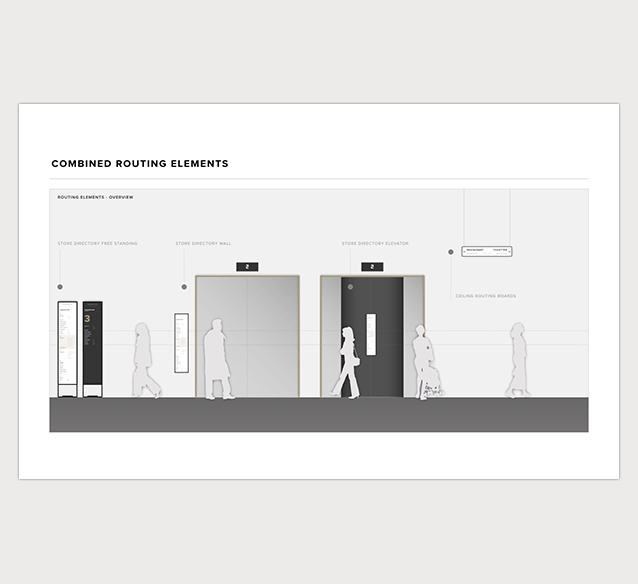
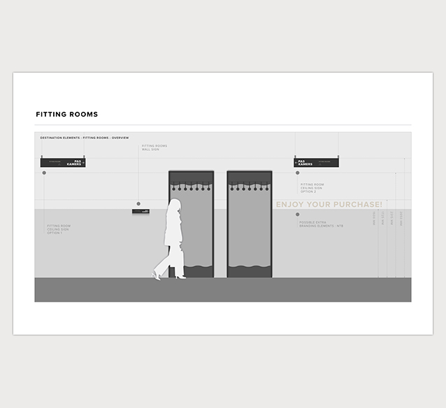
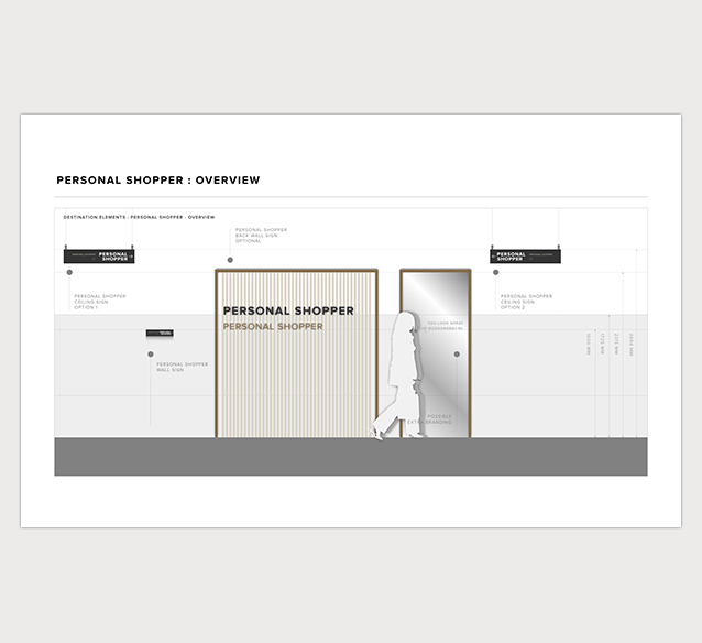
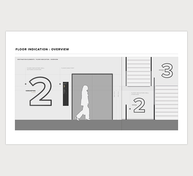
Way finding elements in the store's exterior and interior
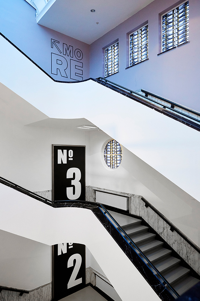


Different retail zones are also clarified by using wall graphics


TEAM
Erik Schuur
Concept, design and visual system
John van Dorst
Creative director
Esther Visser, Roosmarijn Groenendijk & Lisanne Besselink
Project management